Greenpeace USA:
Creative Audit + Rebrand

Greenpeace is the bad boy of the nonprofit realm — and we wanted their creative to reflect that.
We wanted to present a concept that embraces a disruptive, gritty visual language pulled straight from activism and protest culture — while still using some of Greenpeace’s existing brand assets in a new way.
Their old look & feel

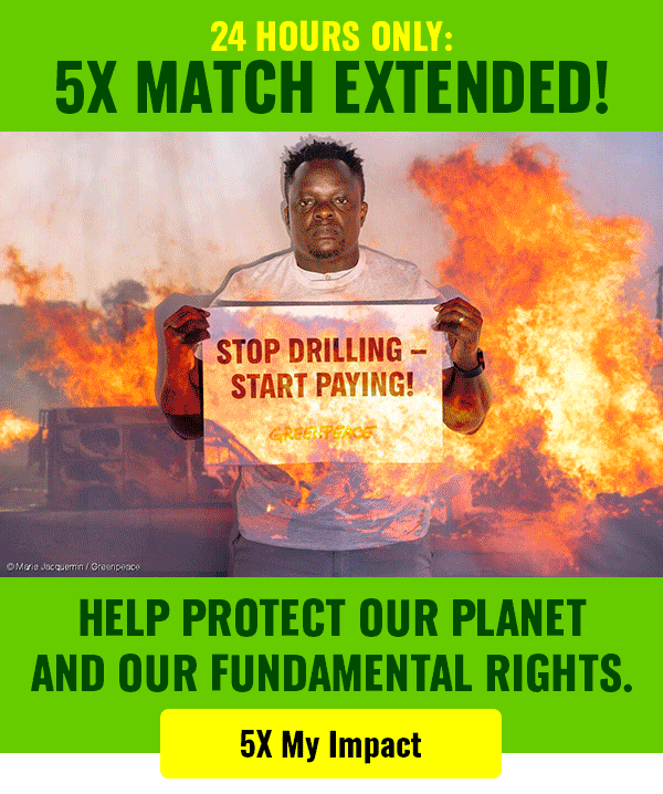
Greenpeace’s old creative: while bold, lacks soul. It’s missing the heart of what Greenpeace stands for: fighting for a sustainable and peaceful future for all.
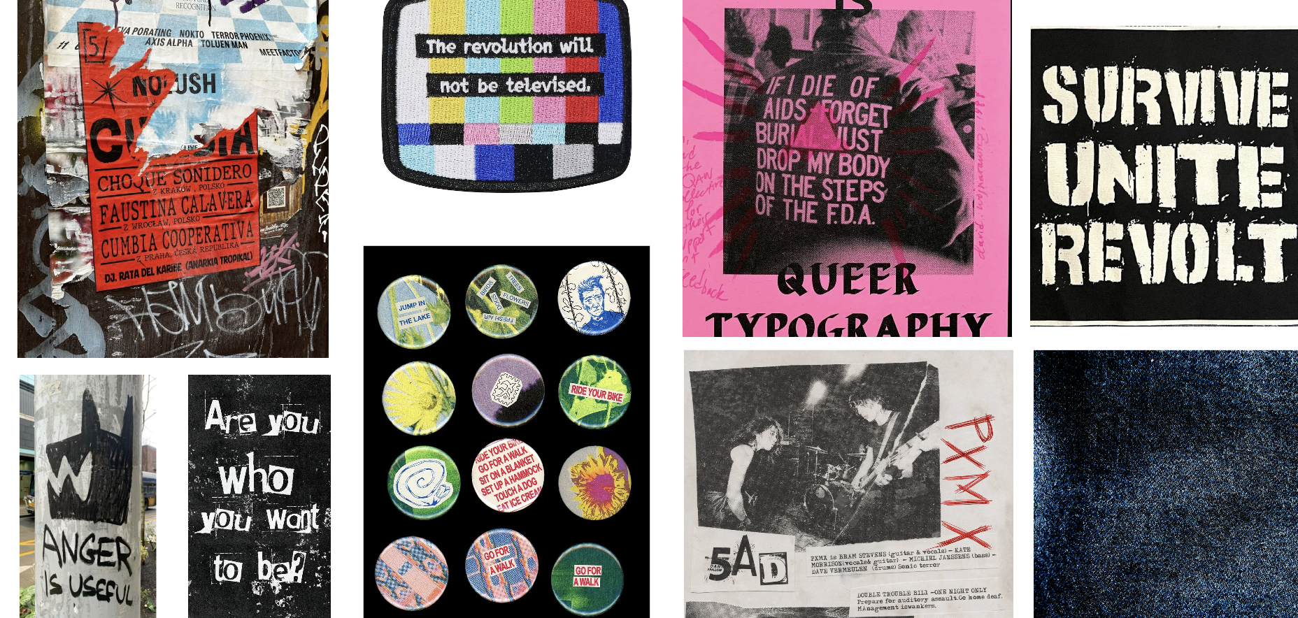
the moodboard
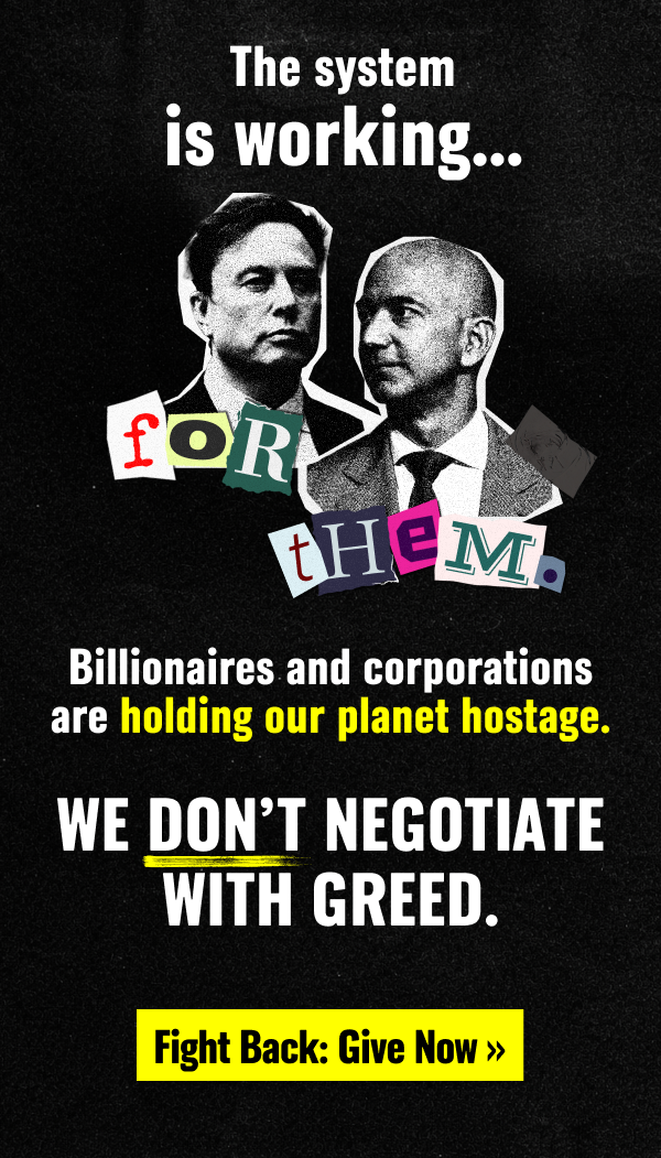
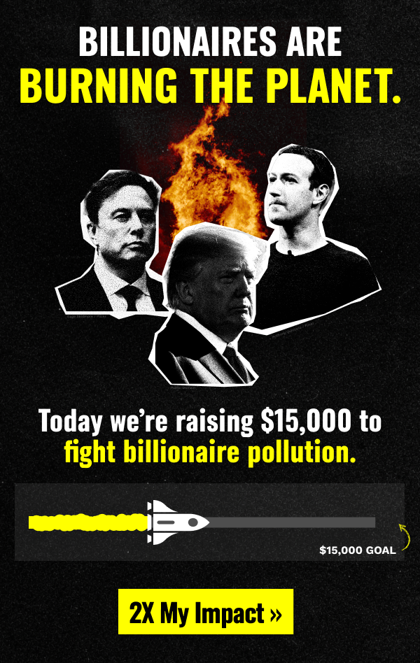
This new direction leans into an unapologetically alternative attitude, framing Greenpeace as a challenger rather than a traditional nonprofit.
This creative rejects neutrality and takes a stance against Big Oil, against the billionaires.
References to counterculture movements of the 70s and 80s feel nostalgic to both the people who’ve lived it, and the current youth who is living through a point in time that is constantly being described as “unprecedented”.

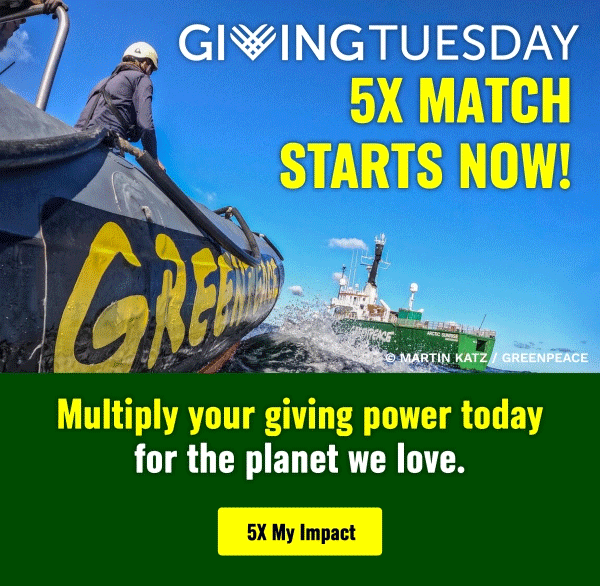
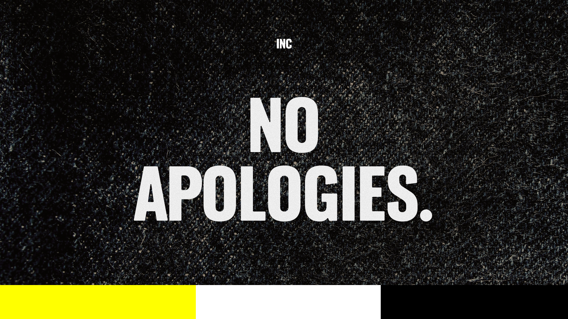
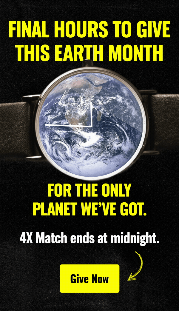
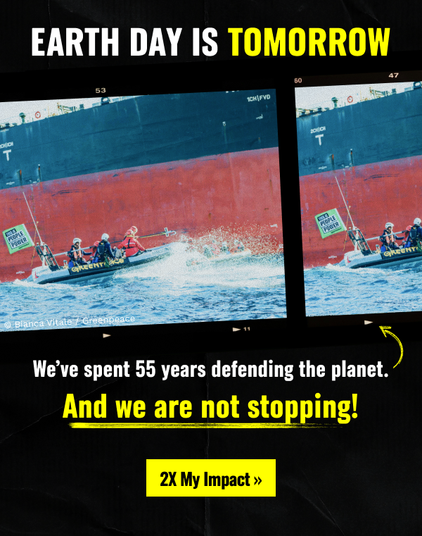
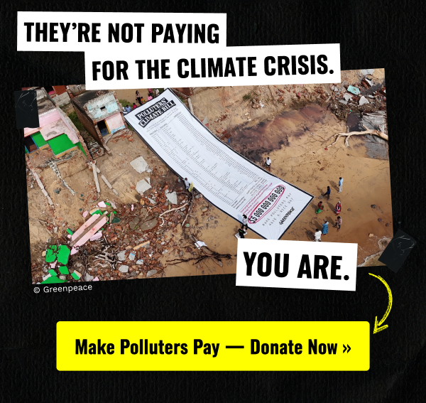
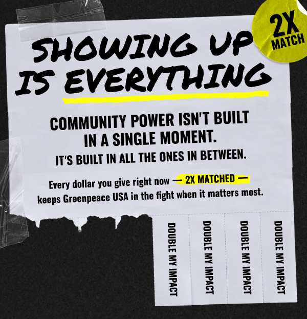
Our new creative


Performance
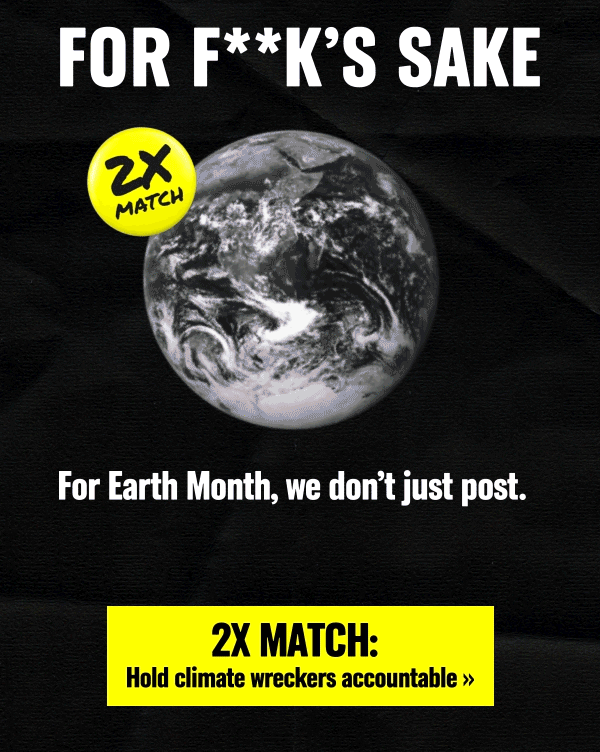
With the launch of the creative during our Earth Month campaign, we saw a massive year over year increase in revenue.
Our “For F**k’s Sake / For Earth’s Sake” creative was a high performer, and really resonated with our audience this year.
Credits
Client: Greenpeace
Agency: Interactive Strategies
Creative Direction: Joe Forsythe, Zoë Soriano, Megan Okrand
Art Direction: Zoë Soriano
Copywriting: Megan Okrand